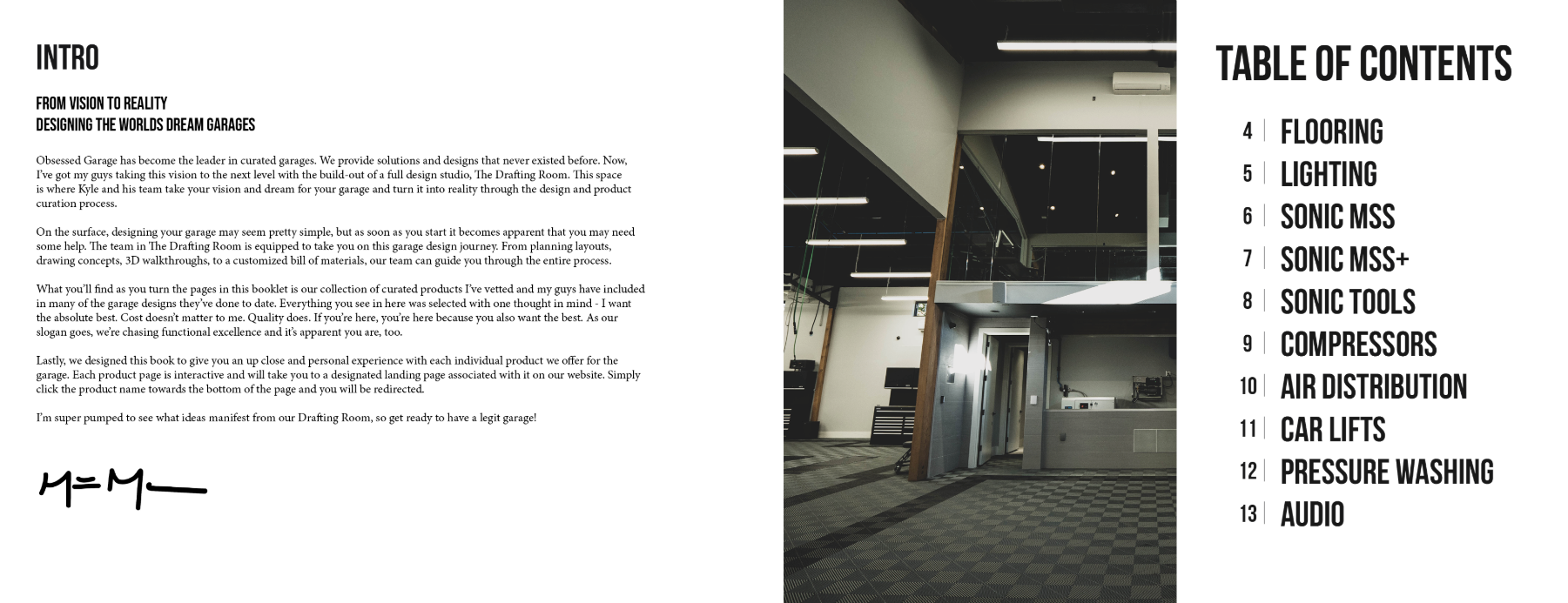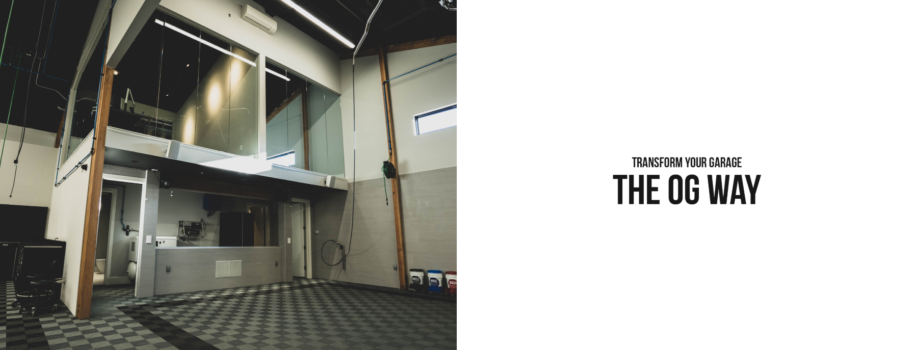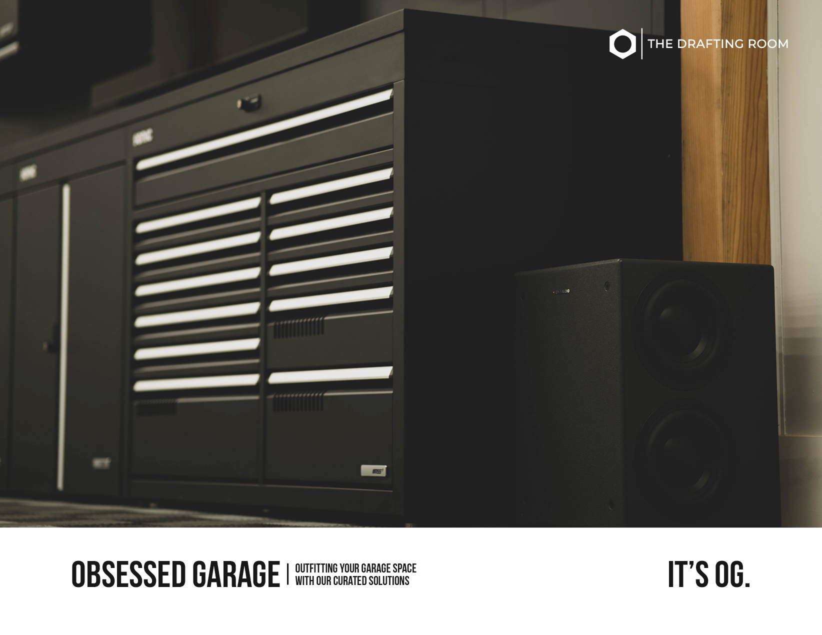
When I set out to design this brochure for Obsessed Garage, my main goal was to let the products speak for themselves. That’s why I leaned into a minimalist black-and-white palette—it creates a sleek, timeless backdrop that doesn’t compete with the products, but instead highlights their quality and craftsmanship.
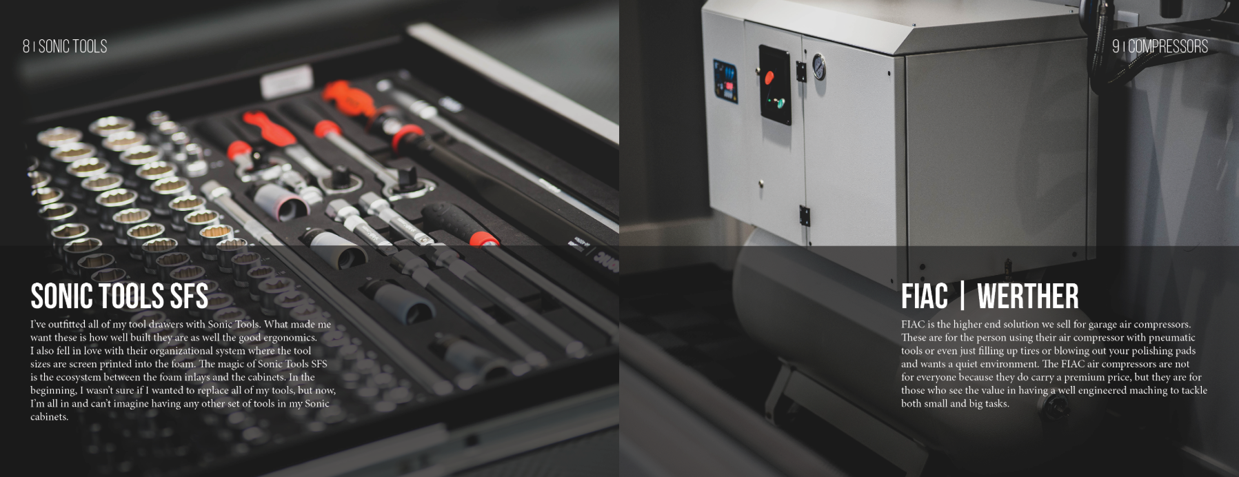
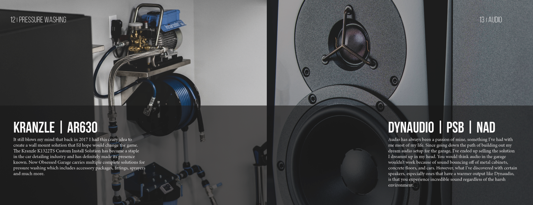
The layout is intentionally clean and spacious, using large, bold images of each product as the focal point. This gives the reader an immediate visual impact and makes it easy to imagine these tools in their own garage. To balance this, I paired the imagery with smaller, concise text blocks that highlight key details without overwhelming the design. Think of it as a visual-first experience with just enough copy to guide, inform, and persuade.
The overall flow of the brochure is structured but not crowded. Each spread feels curated, almost like a gallery—where every product gets its moment in the spotlight. This approach reflects Obsessed Garage’s own brand ethos: intentional, detail-driven, and obsessively clean.
In the end, the brochure isn’t just about selling products—it’s about reinforcing the lifestyle and standard that Obsessed Garage represents. Minimalism here wasn’t just an aesthetic choice; it was a strategy to ensure clarity, confidence, and impact.